Rap It Up
Magazine Evaluation
I think
overall my magazine turned out well. I think it looks very stylish which is
what I was aiming for and I think it also suits the magazine genre. I think the
contents of the magazine are very good and they are very interesting. The
headlines would make me want to read about the story inside the magazine as I
find them very exciting. I think that the images I used are very appropriate,
they will attract customers and they look great. The images I used suit the answers I got from my questionnaire. The questionnaire said that most people are attracted to a magazine by the person on the front cover and I have made Travis $cott really bold and he really stands out. My first draft of my music magazine was quite good at the time but after I did some research, I learned that there were a few simple ways that I could adapt my magazine to make it a lot better such as adding an image or a quote somewhere can give it a really different look as well as giving more information.
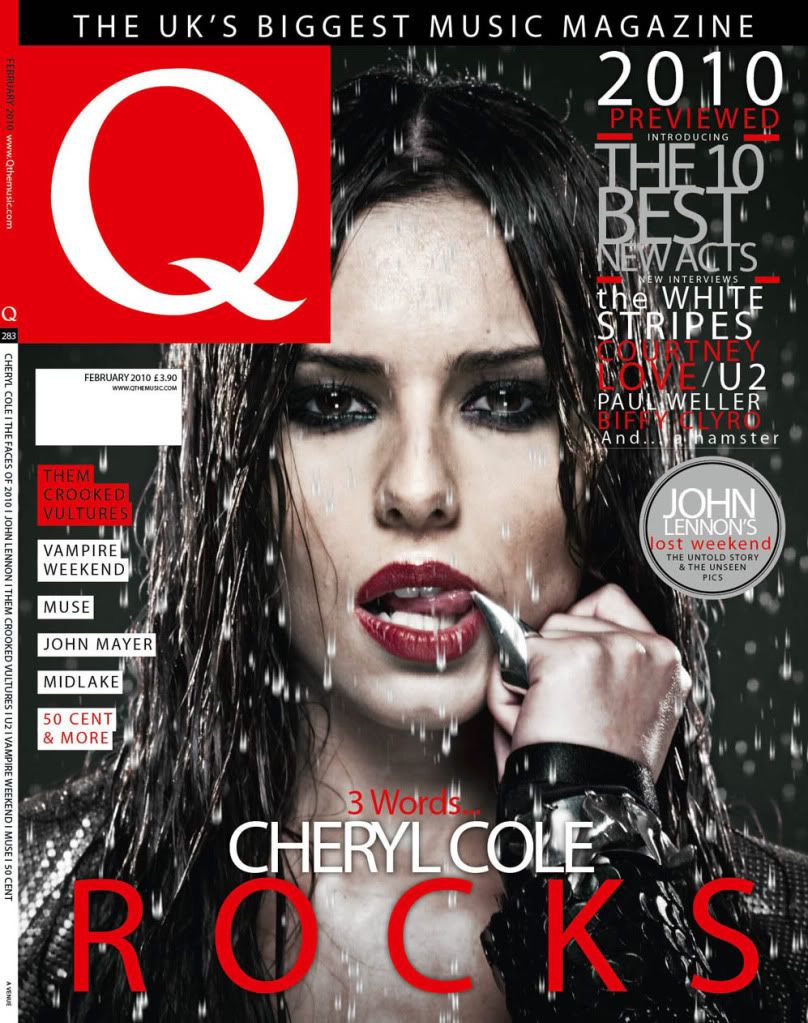
I think my
magazine looks similar to some other music magazines such as Q Magazine, but with a bit of a twist. I
have used a similar type of copy to other music magazines but I have decided to
use a signature type font to make it look like the artist has signed the
magazine and as the artists nickname is La Flame, I've gone with the fiery colours such as orange, yellow and red which also adds a way better effect as it makes it stand out. Another way my product is similar to other magazines is the way I’ve
laid out the pages such as the contents page and the 2-Page-Spread. I’ve laid them out in the same way as a
magazine would but again, I’ve changed them slightly. I think my magazine has a
very iconic colour scheme; it’s quite a dark themed magazine as I feel rap
sometimes isn’t the most upbeat of genres but I think that by adding the hints of fire, it shows a different character to the magazine so it gives the magazine a more unique look as I've never really seen it in any other magazines.
With my
magazine, I’m trying to represent young unknown artists who have a great talent
but they just haven’t had the luck or break in life. I think by using Travis
$cott and his story it is very inspiring to young kids who don’t have much who
are aiming to become a famous superstar as Travis did. I don’t think I will
connect with the audience that doesn’t like rap music as I don’t think they
will be very interested in the stories but I feel that the images, copy, colours and stories I've used will really suit my target audiences preferences as they prefer a little bit of individuality.
I’ve tried
to aim my magazine at teenagers/young adults (16- 24). I’ve decided to make
this my target audience because I feel I can relate to them as I’m within that
age group. I tried to represent this in my magazine by doing many different
things. One of the main things was the images I used. I used photos of a young
rapper who is well dressed and looking very confident. I think this will relate
to most young people as they might want to be like him; to look cool and wear
cool suits. I think the fact that he’s a young rapper who’s been through a lot
of problems it might relate to young people better because it gives them hope
that they might have a chance to become like him whereas I feel if the rapper
was an older person, they may not have as much in common with the target
audience.
I think if
there was to be a company that would distribute my magazine I think it would
most likely be Spin Media. They publish a very wide range of music magazines.
They publish over 20 magazines and websites. They also have a very wide range
of genres including rap magazine, ‘Vibe’. So I think they would be a very good choice of
publisher for my magazine as they have a very similar target audience to me; 16-24 year olds. Vibe also has very similar artists and headlines in their magazines which would also prove that Spin Media would be the best company to distribute my magazine.
I have
learned a lot about technologies from the process of constructing my product. I
have developed a lot better skills using Microsoft Word. I learned a lot about
fonts and images using the software. I also gained skills at editing images by
using Photoshop. Photoshop made my images look a lot more professional and they
looked better quality. The images were taken with a Cannon 1100D so they are
very good quality pictures whereas if I took the images with a phone camera
they wouldn’t be very clear. I have really learned a lot about using Blogger. I had no idea how to use it before I started this course. I have learned how to navigate through the site, write blogs, view other peoples blogs, how to customise my blog and lots of other things.
Looking back
at my product, I feel that I have learned many things about designing a
magazine. I have learned how to style the magazine, how to edit images to make
them look more ‘magazine like’, I’ve learned how to add my own little design to
the magazine such as the ‘signature’ effect. I’ve learned how to use correct
copy. I learned all of these by using the internet and researching magazines.
I think I should've done a lot more research before I started to produce my music magazine as it would've given me a better idea of what to do to attract people to buy my magazine. By doing the questionnaire, I was given a much clearer idea of what people prefer and if I knew that before I started to make my magazine, I may not have found it as difficult to come up with ideas as I would already know quite a few from the results of my questionnaire. Researching magazine covers and contents pages did help but not as much as the questionnaire did.
In the updated version of my magazine, I added a picture of Travis $cott's brother, Franklin. I did this because people would probably want to know what his brother looked like and I also think that that specific image shows the close relationship between him and his brother. Underneath the image, I also added in a little quote saying, 'We were the best of friends when we were young, but then we drifted.', I think this quote will make the reader want to continue to read on and find out what that quote is leading to so it was used to keep the reader interested. On my contents page, I narrowed the width of the images so I had more room for headlines and stories. In the updated version, I added a Facebook and Twitter puff to try and interact even more with the reader so if they find my magazine interesting they can follow what we do on the internet and I think that my target audience will nearly all be involved in social media sites so it would be quite a popular thing. I also changed the some of the fonts of the copy on the cover of the magazine. I did this because I think that all of the fonts were a little boring so I decided to change them and I think that the title has benefited from it especially. I think that the new font for the 'Rap It Up' title fits in a lot better with the theme of the magazine now as it looks a bit like tattoo writing which is a cliché symbol of rap music.